There’s more to holding the attention of your readers than writing a well-crafted, exceptional story.
Today’s younger readers generally have a shorter attention span and are easily distracted. They often lose interest in even the best-written story after just one or two paragraphs. Even the finest reporting needs to be paired with quality design to assure committed readership.
 Good design begins with a strong visual image. A recent survey revealed that the average reader looks at 75% of the photos in a newspaper, but only 56 percent of the headlines. Worse, most readers actually read only 25 percent of the news, sports and features published in their newspaper.
The goal of every newspaper is to inform, educate and entertain. The business plan is to interest readers and sell as many copies of the newspaper as possible. This requires exciting and attracting the readers into the story with tighter packaging, visual excitement, contemporary design and numerous points of entry.
Ninety percent of newspaper readers are attracted into a story through a great photo, unique illustration, creative graphic or stacked headline. Stories supported by a worthy visual element are reported to experience three times the readership than those published simply as columns of text.
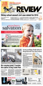
At The N’West Iowa REVIEW we believe photo size does matter. One or two large photos will create more reader interest than a grouping of any number of smaller photos. The old adage remains true: “A (good) picture is worth a thousand words”.
But the key word is “good”. That means the picture must be in focus, have definition and contrast, be interesting and tell a story.

Other design secrets
Good newspaper designers have a number of tricks they use to make various feature stories draw in the reader.
One is to include one or more sidebars presenting fast facts beyond the story. The number of games coached, won and various state titles won in a basketball coach feature, for example.
Another is the inclusion of background information or personal biographies. This is the kind of material that increases the readership of a political or business story.
Checklists are also a popular design feature. They are an easy way to list what needs to be accomplished before a new structure can be opened to the public or new community service is introduced.
Other points of entry include quote boxes, the use of large serif or san-serif letters at the beginning of important paragraphs and drop-in boxes with the final scores near the beginning of each sport story.
Quizzes, surveys and rankings are other ways to attract the reader back into a major news or feature story. Also are sub-headlines, step-by-step guides and maps. We recently used a full-page map in our N’West Iowa REVIEW to inform readers of the route that a new two-lane highway would take across our four-county market.
The way you package your news does make a difference. It inspires and motivates readers, creates a more complete recording of current history and puts you a step above the competition. It is the sign of a truly committed and caring editor and publisher.
 Nevada Press Association The best in Nevada journalism since 1924
